
Before you come for me and say I haven’t done my research, I’m well aware that the 2026 official Pantone Color of the Year is Cloud Dancer; however, if you ask researchers in Germany, it is azurite blue, a stunning, naturally occurring, bright blue. They have found evidence that Paleolithic civilization might have been using this particular blue. A recent Science Daily article says, “For many years, experts assumed that Ice Age artists relied almost entirely on red and black pigments, since nearly all surviving artwork from this time uses those colors. The limited palette was often attributed to a scarcity of blue minerals or to the belief that blue held little appeal.” It has the scientists rethinking color and ice age people’s perspective on the importance of color. “The presence of azurite shows that Paleolithic people had a deep knowledge of mineral pigments and could access a much broader color palette than we previously thought – and they may have been selective in the way they used certain colors,” Dr. Izzy Wisher, lead authority in the study, says. This makes me wonder…What importance does color have on our world?
As map makers, we know that color is vital. Professionals know to question “default” and consider what message we want to convey with the map. The Color Brewer by Cynthia Brewer and Mark Harrower at Penn State has long been a go-to. If you haven’t checked it out, you should. John Nelson regularly shares considerations and how-to’s on color and maps on his blog, Adventures in Mapping. Some of my favorite maps that feel more like professional graphics do a great job of sending the message without a traditional legend. In particular, I admire his map of happiness that uses color, shape and size to quickly convey happiness in countries on the map. Amidst the dark background, it is easy to understand the data factors contributing to happiness, like a complex multimedia piece of art that causes us to react.
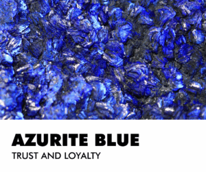 Image created in Canva by BD.
Humans respond to color. According to the Interaction Design Foundation, they respond in three ways: “biologically (e.g., red = fear), culturally (e.g., red = wellbeing in many Eastern societies) and personally from experience. Designers use color symbolism in (e.g.) logos to gain users’ trust and attention.” Many careers involve applying color theory across many fields, including Graphic Design, Interior Design, Fashion Design, and Branding, with roles like Color Consultant, Color Specialist, and roles in Packaging, UX/UI, and Web Design where you guide choices for mood, function, and appeal, often using digital tools and focusing on trends, psychology, and client needs. Think about it…Why do so many logos in the geospatial community have blue and green in them? If you’re working in the geospatial industry, we most often see earth colors and subconsciously trust those colors
Most people have a favorite color. Do you trust that color more? The folks at Verywell Mind speak about the effect of color psychology on mood feelings and behaviors. Have you been house hunting and find yourself jarred by the owner’s color choices? As you tour the house, you think, “That red kitchen has got to go!” or “What were they thinking by painting a whole room chartreuse?” For that reason, many real estate professionals will tell you to neutralize your home’s color palette before listing it. Do we trust beige? Not necessarily, but it does provide room for imagination. Interestingly, blue is considered the color of trust and loyalty. No surprise that it would become a popular choice for businesses. If there’s a color design dilemma at my house, blue generally wins. Everyone in the house likes blue.
If you like blue, then you might wear more blue. Are you wearing the right blue? Is blue in your wardrobe color collection? Some colors do make you look your best. These color collections are grouped by season and then light and dark various of those home seasons. You can hire an expert or find an app and let AI tell you. You probably already know. You feel best in some colors over others. Your hair color, eyes, and skin tone all play a role in looking your best…in color.
Color has been part of human life for ages. Early cave paintings featured red due to abundant clay pigments. Nature continually reveals new color combinations that influence our homes, fashion, and creativity. Which color inspires you most this year?
If you need me, I’m on a mission to find the perfect shade to repaint my bedroom. I’ve been living with samples for months, but it’s time to decide.
Barbaree Duke
Geospatial Crusader

Leave a Reply